
7 Best Kitchen Cabinets Paint Colors for a Happier Kitchen
“If you hate it, you can always repaint.” That’s what people say about painting and it’s true. But if you’re painting your kitchen cabinets, that’s a lot of work. What if you go through all those steps to paint your cabinets and you end up really disliking the color? What if you wished you had picked a more white white than a cream white?
Save yourself the trouble and read this story before you even pick up a paint brush. We asked seven interior designers to share their favorite kitchen cabinet paint colors. And these aren’t just any kitchen cabinet paint colors, either — these are the colors that will really shine, hold up well over time, and add a bit of happiness to the kitchen.
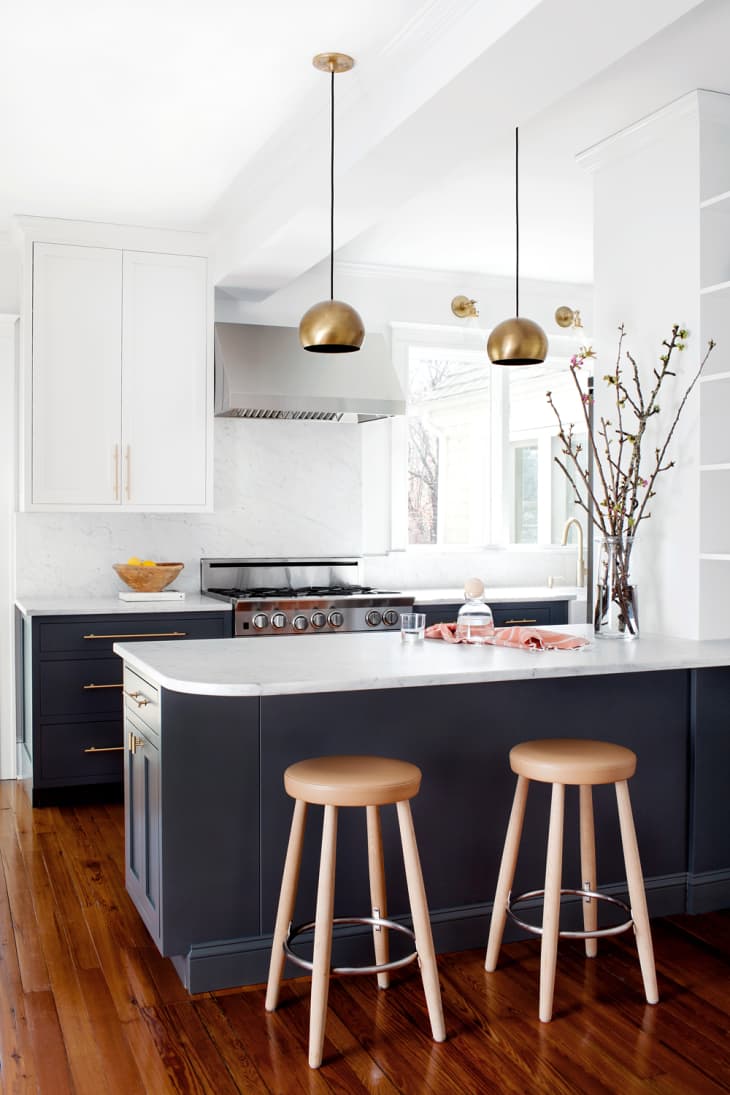
1. White and dark gray
“It’s important to keep in mind how much natural light your space gets before deciding on paint colors. White and a rich, dark gray are my favorite colors to use in a kitchen. We recently used Benjamin Moore Decorator’s White on upper cabinets and Farrow & Ball’s Down Pipe on lower cabinets in a kitchen project and it turned out so well. The dark gray really grounded the design, and the satin brass hardware that we used really popped against it, while white on the upper cabinets and walls kept the space feeling light and bright. For both, we used a matte finish that was still wipeable for a more modern take. Both of these shades also work well with stainless steel appliances and Carrara marble.” — Elizabeth Lawson, Elizabeth Lawson Design
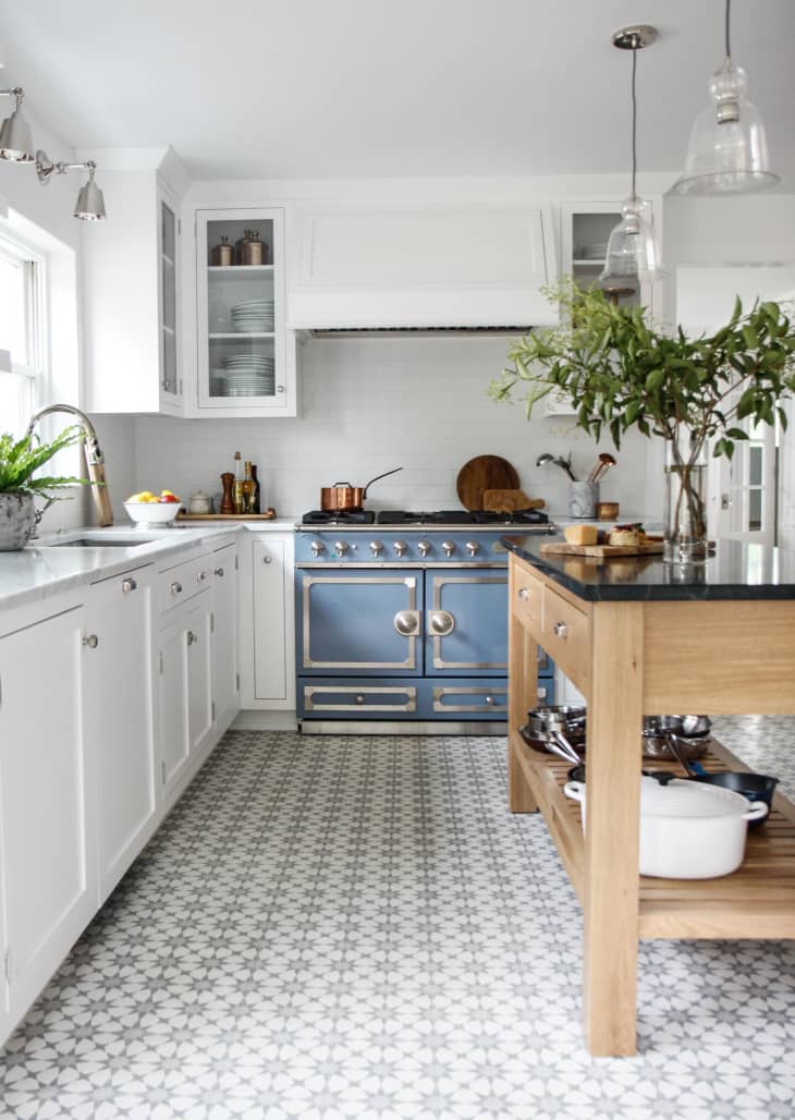
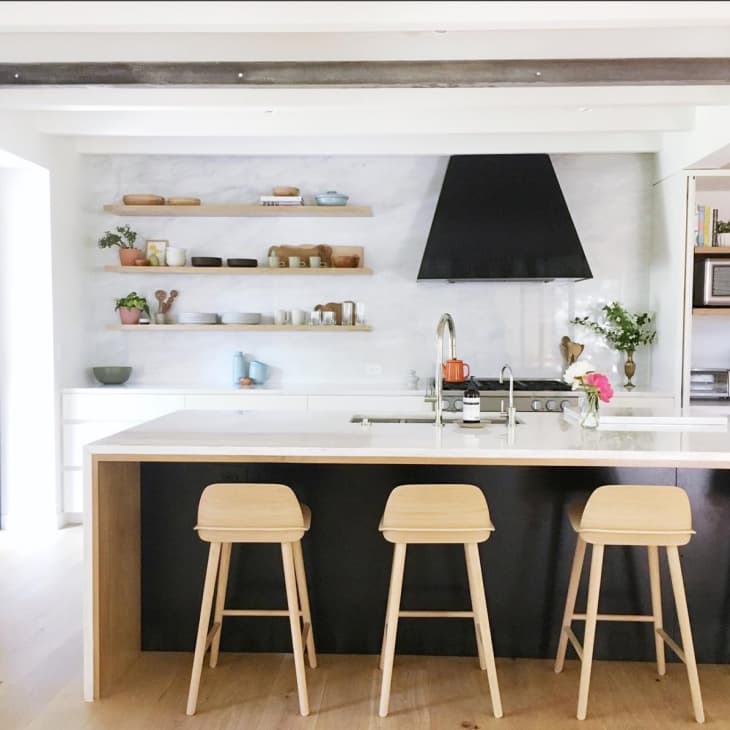
2. Crisp white
“Benjamin Moore’s Chantilly Lace is a nice clean, crisp white that works really well in any kitchen. It allows other design elements to stand out as a focal point, such as the blue stove in the above kitchen, or a warm wood island. We’ve used it in many homes and it always ends up looking great.” — Renee DiSanto, Park and Oak
3. Understated gray
“When it comes to kitchens, I never tire of bright, white spaces. It’s a classic look that stands the test of time and allows your furniture (and food!) to be the hero of the room. That being said, I love adding a subtle contrast to strong white walls with Farrow and Ball’s Cornforth White in their Estate Eggshell finish for the cabinetry. It’s a wispy shade that reads like a cloud-gray and adds the perfect amount of depth to a space.” — Crystal Palecek, Crystal Palecek Interiors
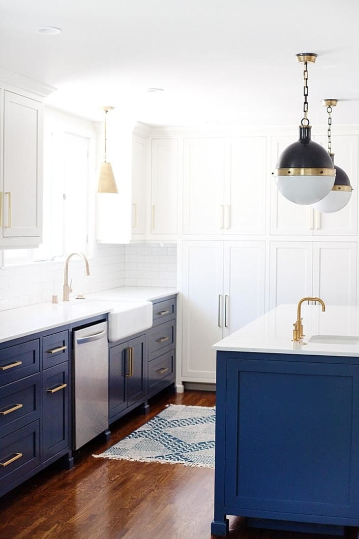
4. Vibrant blue
“If we are going for a bit of a bold contrast, we tend to gravitate towards darker blues. In the kitchen above, Benjamin Moore’s Hale Navy gives the space a lot of depth and warmth. The blue is timeless, but makes a statement, which is one of our favorite design combos!” — Megan Papworth, E. Interiors
5. White and dark gray
“To add a splash of sophistication to bright white kitchens (my favorites are Farrow and Ball’s All White and Benjamin Moore Decorators White — both are bright and welcoming), I like to add a dark gray, like Benjamin Moore Gray to the cabinets. It’s the perfect combination. These colors go with all finishes (stainless steel, brass, bronze, black, etc.) and complement both a natural stone (such as marble) and a quartz counter.” — Claire Zinnecker, Claire Zinnecker Design
6. A slightly off-white white
“We love using Benjamin Moore’s White Heron for kitchens. It’s a beautiful, bright white without any weird undertones. The color feels light and airy — we love the way it works with Carrara and Calcatta marbles, as well as colored countertops and tiles, because it’s such a neutral and versatile hue. On cabinets and trim, we usually use a satin finish unless we want a higher gloss or a hand-painted look — then we switch to semi-gloss.” — Amy Storm, DesignStorms Interior Designs
7. Greige
“Generally when a paint color goes wrong, it’s because the wrong undertone was selected. Gray isn’t just gray — there are blue-grays, green-grays, purple-grays, etc. Balboa Mist by Benjamin Moore is the perfect greige (a mix of beige and grey). Often times, we are dealing with existing tile that has a lot of gold and I’ve found that Balboa Mist can really help tone it down for a more cool, neutral affect. It’s literally the perfect shade to complement so many things.” — Leyla Bowden Jaworski, Design Shop Interiors
Have you painted your kitchen cabinets recently? What color did you use? Or maybe you’re currently eyeing something specific? Tell us in the comments!